As my project draws to a close, I'll leave you with a link to the presentation that I'll be giving in a few weeks. Here is my powerpoint, if you want to take a look.
Goodbye and thank you for following along!
Friday, April 22, 2016
Friday, April 15, 2016
Everything But Animation
Hi everyone,
This week I didn’t do much animation; I only spent three hours on my SRP because I’ve been visiting colleges since last Thursday. I actually flew home between visits just to attend the BASIS powerpoint presentation workshop.
I’m pretty tired right now since I’ve had kind of non-stop visits for a while. Since I don’t have all that much new information about my project to share with you (I’ll be doing extra in the coming weeks to make up for what I didn’t get done), I figure I can just talk for a bit about my visits and the art-related things I’ve done.

I mostly just drew during my flight to Boston and while waiting in the airport. Here are some sketches from that time:


I’ve never tried to draw while being jostled around by turbulence before, so that was an experience.
I was also working on converting this image into a video, but I forgot to export it before I shut down my laptop so I lost the timeline. The drawing was inspired by an illustration that I’m struggling to find right now, but I had seen it months ago and thought it fit the look/aesthetic I was imagining.

In addition I drew the person sitting across from me while I was waiting to board at Sky Harbor. I think he might have seen it when he stood up so hopefully it isn’t a good enough likeness that he recognized himself.
 |
| I always draw a circle to place the head and end up completely ignoring it |
My project might not have progressed much, but I did advance my personal art knowledge a bit. For example, this week I learned what shrinky dinks are. Apparently my life has been lacking in crafts. If, like me, you have no idea what a shrinky dink is, it’s a drawing on this weird type of paper that shrinks and hardens with heat. So I basically microwaved some doodles and ended up with these little charm-type objects:

I also went to the Boston Museum of Fine Art. I was hungry the whole time but it was lovely. There were lots of intriguing textures and the rooms were alternately too hot and too cold.

Next week I’ll be doing extra SRP work so I will have more to show you.
Wednesday, April 6, 2016
Not Sure What Week It Is But Hello
I think most of you probably get the gist of how I’ve been animating at this point, but sometimes I feel like I don’t explain things very well or could be more detailed. And on one of my last posts Keanan asked about how I do it, and I don’t think I ever responded (sorry Keanan) so I’m going to now. While I was working these past couple days I recorded my screen to show you exactly what I’m doing. Unfortunately I only remembered to do that after I’d already gotten some layers down, but you’ll be able to watch almost the entire process.
I’ve been practicing drawing facial expressions because I think I could use some work there. I have this habit where I make whatever expression I’m trying to draw, which is not useful at all but makes people look at me weird sometimes. Anyway, I decided to draw my monster feeling down in the dumps.
Each of these videos was originally about 25-30 minutes long so I’ve sped them up quite a bit. With that in mind, maybe you’ll get a better sense for how long it takes me to animate. I was also working pretty messily here, with basic shapes, scratchy lines, and only a few colors, and a more complex scene would take even more time.
In the above video I’m drawing the lines. Because most things stay the same from frame to frame, I copy each layer and make minor changes instead of redrawing it each time (which is what I had to do in earlier videos I’ve shared—the walk cycle, the birds, all of the volcano videos).
Here I start coloring. I make a layer underneath each layer of linework and just color under it. The stripes of colors in the corner are on a separate layer on top of all the others. They make it easy to change my brush color without having to change between layers.
Apparently I was recording audio too, sorry for the weird sped-up noises in some of these videos.
Now that the coloring is done I can take all of my layers and convert them into an animation.
Now that the coloring is done I can take all of my layers and convert them into an animation.
This is how you string layers together into video. I’m showing you both ways: create a video timeline (first) and create a frame animation (second). I’m not too sure of the technical differences between the two, because they can both achieve pretty much the same result through different methods. I use the first method to make videos and the second to make gifs.
This part always seems like it takes forever. Especially for the create-a-video option, I don’t know if there’s a way to shorten all the pieces at once so I have to do each one individually. And I can never decide how fast I want the frames to play, so sometimes I have to change the length of each piece three or four times. But I didn’t fidget with the speed as much as usual here, because it’s such a simple animation.
I made a mistake in the video that I caught and corrected in the gif. I accidentally switched two layers and the colors ended up on top of the lines for one of the frames:

And here’s the gif:
 |
| the colors here are truer to the psd than those in the videos |
I think this kind of super-short animation is my favorite. It’s still the same effort-payoff ratio as a longer animation, but it’s less of a commitment and I never get bored of it before I finish, which tends to happen if I try to make a 15+ second scene in one sitting.
Friday, April 1, 2016
It's April Fools' Day
Happy April Fools' Day! This morning I thought this was the day Caesar was killed, because I forgot about the ides of March, but nope. I was wrong. It's just the first day of April.
So I finally have a walk cycle to show you! I made a couple but this one’s my favorite:

I still need to work on how the weight is carried, and obviously the figure isn’t detailed, but I’m happier with it than I was with earlier ones. That was the last one I did, and surprisingly it took a lot less time—hopefully because I’m getting better, but that remains to be seen.
I always struggle to get the correct up-and-down motion of walking. I forget how legs are positioned at the height of the stride and as a result everything looks a little off. This time I bit the bullet and used a guide the whole way through, and that saved me a lot of annoyance. I had a book on the basics of animation laying around and it had some very helpful tutorials, and also this less-relevant but still interesting explanation of how to draw a dancing alligator.

And as I’m writing this I see that the book also has instructions for animating a dancing hippo. Kind of an odd niche but I like it. Anyway, if you’re curious, this is the reference I used to help capture the bobbing motion:
In addition to walk cycles, I’ve been drawing lots of birds because I like it and I want to. I like the idea of a trio of birds bobbing after my main character, but I like drawing them much better than I like animating them. They’ve gone through a lot of iterations, but I think these three pictures give you the gist of it (the first drawing is from a while ago, maybe three or four weeks).

 |
| Do you think I should change their names? Claude, Henrietta, and Noam (thanks Nithin) were also in the running. FYI, despite having traditionally gendered names, these birds are agender and reproduce asexually. It's just that when I looked up gender neutral names, Laundry was at the top of the list. Laundry. |
I really liked this background from last week (that I posted Tuesday (I think)):

It might be the first one that came out looking almost exactly as I intended it to, instead of veering off in content or color or whatever else. I drew a few more scenes from that same environment.
 |
| I don't know what I did wrong with my brush settings, but I could not draw one clean-edged line in this. Everything was a little blurry. I think I made the picture small enough that it's hard to tell, though. |
My original idea was actually set in a swamp, so I was thinking about that a lot in October and November. However, the story kept becoming too similar to Over the Garden Wall, which I love but which I do not want to plagiarize. So instead I redirected, but I’m glad that I’ve been able to work some of those initial thoughts into my current plan.
That’s what I’ve done this week that relates directly to my project. Admittedly I’ve been doing a fair amount of drawing and animation that has absolutely nothing to do with my SRP, and I keep getting sidetracked and trying out different Photoshop tools (specifically, I spent a while messing around with brushes while I was drawing birds). I feel like I should retitle this blog Doing Some Animation, and Some Other Stuff, and Playing With Photoshop Aimlessly.
So I’ll leave you with that.
ALSO: I keep forgetting to mention this, but there’s a science fiction short film called World of Tomorrow that I really enjoyed (and apparently it won an award at Sundance, so if you don’t trust my recommendation maybe that will convince you to watch it). The way it uses color is similar to how I imagined I would be doing in February, and to be honest, after watching it I kind of wish I was making something weirder. I watched it with our very own Molly Ono and it’s on Netflix. Go forth and see!
And a second ALSO: Okay, I checked and I misread Landry as Laundry, but my point about gender neutral names still stands.
Tuesday, March 29, 2016
Images, My Favorite
as promised: |
| I'm trying to figure out how to make the dots move around slowly. It'd be easy in Flash, where I could create a motion path, but in Photoshop I have to move them by hand and it makes the motion look jerky instead of smooth |


 |
| here you go Casey |
And this is the walk cycle I mentioned last Friday, plus an animation that I meant to put in my March 18th post but blogspot wouldn't let me embed it
I remember that took me SO long to do, and then during critique all the TA said was "hills get lighter as they recede" and I was like OKAY THANKS TIM (but now my hills always get lighter as they recede, so in hindsight it was helpful)
Friday, March 25, 2016
Happy Nondenominational Second Spring Break
Hi everyone,
I am currently en route to Sedona, and I stupidly left my laptop at home so I won't be able to share any photos with you today. I'll probably post some backgrounds when I get back on Monday or Tuesday, but for now we will all have to make due with this bland and imageless blog post. I also can't check the word count on my phone, so I'm just going to wing it and hope I end up above the requirement. Also, enjoy this large font that I can't change back to normal.
This week, I mostly worked on more of the same: drawing frames and backgrounds. I actually had to switch out the nib on my tablet pen because the edges had started to fray from all the use it's been getting these past months. One new development is that I've been drawing walk cycles for different characters. These are pretty self-explanatory, but in case you haven't heard of it, a walk cycle is a series of frames that show the different parts of a gait and loop to show someone walking (or running, shuffling, etc). Previously I've only done walk cycles in Flash, not Photoshop, but so far there isn't really a difference between the programs. I haven't made one that I'm satisfied with yet, but I do have an old one that I might post along with the other drawings once I have my laptop.
I'm not sure whether I mentioned this, but I was planning on the last scene of my animation being a dance party (mostly because I want to animate weird movements and it's a good excuse to use bright flashing colors, but also for legitimate narrative reasons, I swear). A few days ago I found a short that solidified this plan. It's called Slaves of the Rave and was made by William Garratt. I think that link should work, but blogspot keeps warning me that Safari is an unsupported browser and ''may behave erratically," so if it doesn't work it's easy to google. The short doesn't actually have much dancing, and it's not super visually complicated, but I found it very entertaining and I really like the line quality, so if you have a minute you should definitely go watch it. It also has a lot of yellow and I love yellow.
Someone else that I've been a little inspired by is an artist named Juliette Brocal. I recently was talking to a classmate of mine from a RISD summer thing, and she mentioned this artist. I really like how illustrative and gestural her work is; it reminds me of concept art. She mostly does digital art but uses very textured brushes, and her backgrounds sometimes look a bit like a collage. Her color palettes especially caught my eye.
Sorry again about no pictures, but I'll put them up after the weekend, or at least in next week's post.
Friday, March 18, 2016
Hi everyone,
I forgot to post that my break was last week, so: my break was last week. It was nice to not hunch over my tablet for a while, but I did feel a little anxious about my progress. This project is about halfway over but it isn’t halfway finished. I think this is partly because I keep finding myself spending time on parts of the process that aren’t actual animation, like drawing lots of different backgrounds and objects and experimenting with character design. Today I spent two hours messing with brush settings on Photoshop without even realizing it.
At this point I’m fairly sure that my animation won’t be as long as I projected in December. I do still have many weeks left, but I know my pace won’t match up with my original end goal. For some context on why I think this, two years ago I spent a month taking art classes at Otis College, and I spent 24 hours a week animating with a professor present to help me with each little problem that cropped up. I made several short animations, but none longer than one minute and all very simple. This was the first animation I ever made:
I don't even have the actual video, just this extremely shaky video I found on my phone. That animation was meant to exemplify stretch and squash, one of the basic principles of animation (I only got halfway to making the circle into frog before I had to move on, so I forgive you if you can’t tell what it is). Here’s another short that’s slightly easier to parse:
Now I’m committing less hours per week than I was while at Otis, and I’m also using a drawing tablet rather than a Cintiq, which is a bit harder for me to adjust to. But the main reason is that my interests have shifted. Usually when I make art, I don’t like to plan it out. I mentioned before that I chose to make my color script less detailed because I didn’t want to tire out my ideas. That happens often when I make thumbnail sketches or plan projects, and this was the most planned art piece I’ve ever undertaken. I’m not surprised that I’ve gotten sidetracked by the individual aspects of this project (mostly character and background design), and I haven’t lost enthusiasm, but I do wish I could’ve kept my momentum going. However, I’m actually not too disappointed because I’m still intrigued by all the facets of my project. I’m also very glad to learn all of this about myself now rather than after, say, deciding to major in animation. Of course, I’m not going to stop animating, but I think the end result will be more exploratory and experimental than I previously intended.
I forgot to post that my break was last week, so: my break was last week. It was nice to not hunch over my tablet for a while, but I did feel a little anxious about my progress. This project is about halfway over but it isn’t halfway finished. I think this is partly because I keep finding myself spending time on parts of the process that aren’t actual animation, like drawing lots of different backgrounds and objects and experimenting with character design. Today I spent two hours messing with brush settings on Photoshop without even realizing it.
 |
| here are some tree type things, plus everyone's favorite, mushrooms |
I don't even have the actual video, just this extremely shaky video I found on my phone. That animation was meant to exemplify stretch and squash, one of the basic principles of animation (I only got halfway to making the circle into frog before I had to move on, so I forgive you if you can’t tell what it is). Here’s another short that’s slightly easier to parse:
Now I’m committing less hours per week than I was while at Otis, and I’m also using a drawing tablet rather than a Cintiq, which is a bit harder for me to adjust to. But the main reason is that my interests have shifted. Usually when I make art, I don’t like to plan it out. I mentioned before that I chose to make my color script less detailed because I didn’t want to tire out my ideas. That happens often when I make thumbnail sketches or plan projects, and this was the most planned art piece I’ve ever undertaken. I’m not surprised that I’ve gotten sidetracked by the individual aspects of this project (mostly character and background design), and I haven’t lost enthusiasm, but I do wish I could’ve kept my momentum going. However, I’m actually not too disappointed because I’m still intrigued by all the facets of my project. I’m also very glad to learn all of this about myself now rather than after, say, deciding to major in animation. Of course, I’m not going to stop animating, but I think the end result will be more exploratory and experimental than I previously intended.
Friday, March 4, 2016
Look at that Unicorn! Just Kidding, Those Aren't Real Even Here
Hi everyone,
I may go back and make some minor tweaks if I have time, but these scenes are essentially finished. Yellow isn't showing up too well in Blogger's video format, so just imagine everything is yellower than it appears to be.
The landscape is fairly similar to my rough draft in form, but the colors shifted a lot. If you recall from a couple weeks ago, the volcano started out blue, almost teal, and now it’s somewhere between lilac and lavender.
I ran into an unexpected problem when I was trying to compile the mp4s into one video. I’ve never used multiple PSDs (Photoshop documents, a file format that preserves layers) for one animation before; all my previous animations were short and uncomplicated enough that I could use only one PSD. Since this animation has varied backgrounds and is lengthier than anything I’ve made previously, creating scenes in individual PSDs made sense. However, when I exported the PSDs to mp4s and tried to combine the videos in Quicktime, the estimated wait time quickly jumped from 10 seconds to this:


Considering that that’s longer than I’ve been alive, I need to find a new method of combining the smaller videos. I tried iMovie first, because it was automatically installed and seemed easy enough to use, but it forces me to crop images in a way that hides parts of my drawings. Although this problem isn’t really a pressing issue at the moment, eventually I will need to resolve it or I won’t be able to string all the pieces together.
Here is an in-progress look at the very first scene, which takes place before the first video above. The yellow caterpillar-ish arc is the motion path of a bird in flight (remember those blobby bird sketches from last week? Now they’re blobby digital sketches!)


In retrospect, the colors of the first couple scenes actually match pretty well with my laptop background. Maybe I’m unconsciously inspired by it.

I’ve found that the best way to work is in short bursts; otherwise I tire myself out or become frustrated by how hours of work can boil down to three seconds of motion. Taking breaks helps a lot, and I usually spend them drawing for my own amusement. Since my group member Casey shared a picture of me on her most recent blog post, I’ll leave you with this gif I made of her when I was bored today.


Unrelated to my project, but watching the eyes fall out of time with each other feels like a weird poor man's version of Felix Gonzalez Torres' "Untitled" or Perfect Lovers. Minus the meaning and deep sentiment.


Unrelated to my project, but watching the eyes fall out of time with each other feels like a weird poor man's version of Felix Gonzalez Torres' "Untitled" or Perfect Lovers. Minus the meaning and deep sentiment.
Friday, February 26, 2016
Real Eyes Realize Real. . .Leaves
Hi everyone!
This weeks calls for exclamation marks because, at long last, I am finally able to see what I’m drawing. I lost my glasses in October of last year, and now, five months later, I’ve just put my new pair on my face. It’s great to be reassured that trees aren’t actually fuzzy blobs and in fact have leaves.
Speaking of trees—very subtle segue there—there’s going to be a lot of them in my animation, since it largely takes place in a forest. I spent this afternoon doodling trees, and while I think the airy, willowy ones will ultimately work best, I much prefer to draw lumpier designs like the one pictured here in the top right corner:
 |
| As you can see at the bottom left corner, my bird designs are becoming alarmingly similar to Angry Birds |
Maybe I’ll find a way to slip a few of the chunkier ones in.
All of these trees are going to be populating my backgrounds. For the most part I want to stick to flat planes of color in the background, because that’s how the characters are going to look and I don’t want visual dissonance between the two. This is also how I’ve done backgrounds in all my previous animations, and I’m going to carry the method through to this current project.

One problem that has come up in nearly all of the backgrounds I’ve drawn is a lack of attention to staging. I find myself forgetting that I need to create space for the characters to stand and move on, even as I reference my color script as a guide. I think the root of this issue is that I haven’t made a sketch layer in Photoshop for any of the images, a blueprint where I lay all the parts out before I color anything. Doing so would force me to pay attention to the specifications of my color script and put thought into setting up scenes. Instead, I’ve been jumping right into the final product and put down color immediately.
 |
| For some reason, many of the Photoshop brushes look like they're lagging when I use them |
Although that may seem like a difficult way to work, it’s very easy to edit color as I go. Photoshop offers not only the standard “paint bucket tool,” which fills an area with a solid color, but also a color balance adjustment tool that allows all of the colors to be changed simultaneously. Here is a demonstration of how I can view a sketch in multiple different palettes:
Moving forward, I want to refine my backgrounds and finish the ones necessary for the first scenes so that I can turn my rough draft animation from last week into a final version. Hopefully now that I can see what I’m doing, detail work will be easier.
See you next week!
Friday, February 19, 2016
Hark! An Animation
Hi everyone,
This week I finally began to actually animate—just a few dozen frames of the opening scene, but still more than I expected to have done at this point. I’ve been reminded all over again of just how many frames are necessary to make motion look smooth and how so much drawing work is condensed into a couple of seconds. This rough draft has 53 frames in 4 seconds and needs intermediates to complete the motion (24—30 fps is typical in professional animation):
Though drawing frames can be time-consuming, the most tedious aspect for me is putting them all in a timeline, arranging them, and changing their lengths. The longest animation I've ever made had 800 layers and ordering them took a criminally long time. Here's how my current layers stack:
I’m beginning to love Photoshop’s gradient tool, just because it can give so much dimension to a flat shape with very little work on my part. I don’t have a ton of practice with digital art, but I can definitely see the benefits.
Part of the reason I’ve started to animate earlier than I had planned is my color script. These are typically used by artists to provide an overview of all the visuals in a film; the header image of this blog is in fact part of the color script for Finding Nemo. I really enjoy looking at concept art for animated movies, so I’m fairly familiar with the beautiful, detailed scripts made by Pixar that could almost stand alone as illustrated books. But while I was working on my own script, I realized that I didn’t want to dedicate much time to drawing exactly what I would later recreate in Photoshop. I think one of my main faults as an artist is my distaste for planning, which makes me tend to dive into projects and prevents me from doing many preliminary sketches. It also made me unwilling to put a lot of effort into my sketches only to recreate them all over again.
But the most significant factor in my decision to treat my script as a collection of thumbnails rather than dedicated storyboarding was my materials. I prefer to draw in either ink or oil pastel, and chose to use pastels for the script because they’re fast, easy to smudge, and more vibrant (they're also the usual medium of Pixar color scripts). I needed to draw too many thumbnails to use the expensive pastels I usually reserve for large-scale drawings, but my cheaper pastels did not layer color very well. For these reasons, my color script is a lot more primitive than I imagined it would be when I first began thinking about it in December. Still, it gives me a good blueprint to work off. Here are the first two pages:
 |
| You can see how the first page is similar to the animation |
And there you have it; that's where I'm at right now. I’m continuing to experiment with background painting, and I want to pin that down as I continue into next week. I really love the style of Steven Universe landscapes, with lots of smooth layered shapes, and will probably somewhat emulate/incorporate that. In addition I'll be making more jumpy practice animations and trying to figure out which texture brushes I like best.
Until next time,
Rachel
Friday, February 12, 2016
Character and Background Roughs
Hello again everyone!
This week I began to hammer out the basics of my plot and how settings will relate to it. Before I start hemming and hawing over colors, I think I ought to know what exactly I’ll be coloring, which means I’ve spent the last few days sketching my pencil down to a nub.
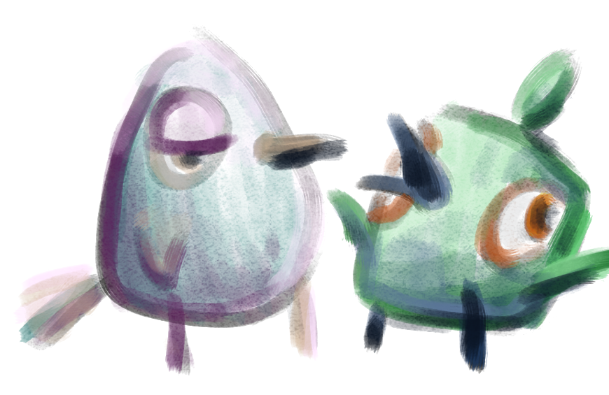
First came the characters. I had already decided that my protagonist will be a monster—not that that narrowed my visual options at all. A monster can be anything or anyone, from the bright and cutesy cast of Monsters, Inc. to the dramatic illustrations of Lovecraftian horror to a regular person. If anything, I felt more spoiled for choice after making that decision than before.
I was able to create many loose potential designs by reminding myself that even if I thought I made a mistake, quirks and jagged lines made the characters more interesting. After all, it’s fairly impossible to draw a monster wrong.
I was partly inspired by an assignment given to fifth and sixth graders by Ms. Hardy, who teaches both lower and upper school art class. Whenever students finished a project early, she asked them to draw a monster. In my months as a teacher’s assistant, I saw dozens of wildly varied drawings: waffle soldiers, three-eyed evil forks, and lots of weird unquantifiable things. The specific, detailed oddities of these sketches had been turning over in the back of my head for most of this year, and when the time came to begin this research project, I was unsurprised to find myself fixated on monsters.
Here are my some of my early character sketches:

Whenever I found myself getting too knotted up in character design, I rerouted and worked on environments instead. Backgrounds are extremely influential on mood, but many people I know seem to overlook their importance. To get my head in the game, I went back to basics and re-watched some of my favorite animated movies, focusing on the background paintings. Sleeping Beauty stood out for its immediately recognizable and illustrative landscape style, but The Land Before Time takes the cake for its deftly framed scenes and careful, beautiful, and precise use of color. That's what I'll be working towards in my own animation.
Now that I have a grasp on the forms and shapes that will be populating my short film, I’m ready to factor in color. In the coming week, my next step will be the creation of a colorscript, which is essentially a colored storyboard that will allow me to see how all of the scenes look together.
Until then.
Rachel
Friday, January 22, 2016
An Introduction
Hello! My name is Rachel Lincoln and I’m a senior at BASIS Scottsdale. As I finish my last few months in high school, I will be exploring one of my academic and personal passions outside the classroom, in the form of a research project. I’ve been taking art classes for years in school, and I’ve tried my hand at many mediums, but one specifically has fascinated me—animation. Though animation is pretty far out of my artistic comfort zone, it does share common elements with other art forms; of particular interest to me is the importance of color. In my research project, I will explore how color shapes and bolsters emotion and plot by creating my own animated short film.
Since its inception, animation has been a wildly popular method of storytelling. It allows so much freedom with color, which can affect our interpretation of a narrative enormously. In animated scenes where no detail is random or happenstance, color becomes a tool with immense potential. Why does nearly every Disney villain wear red, purple, or black? Why are Sith Lords’ lightsabers red? In a medium as visual as film, color is just as vital as plot to the success of a story. Color contributes to characterization, determines the atmosphere of an environment, and creates powerful symbolism.
Led by Disney, animation studios have been producing more vibrant films, especially after the introduction of digital techniques made coloring simpler. Now animators can easily take advantage of colors’ connotations to affect the mood of a scene in very specific, deliberate ways. The thoughtful use of color in movies like Finding Nemo, WALL-E, and Spirited Away fascinates me and has inspired me in the past to choose unusual colors when working on projects in traditional mediums; I want to direct that inspiration back to the source and try my own hand at drawing a color-conscious film.
With the help of my mentor Peter Hannan, I will further my Photoshop fluency and learn how animate digitally. But the focus of my research lies beyond the technical aspects, in more organic and arguably subjective territory. By looking at landmark examples of films throughout the history of animation, and with a healthy does of my own intuition, I will examine how the use of color has changed and apply my findings to my own film as I experiment with narrative and color.
At the moment I’m just beginning to conceptualize my short, but I’ll soon start researching and animating in earnest. You can read more about my project here. Until next time,
Rachel
Subscribe to:
Posts (Atom)